
FEZ Contest Walkthrough
Posted: by K² inThis page is the WIP (Work in Progress) Walkthrough dedicated to the FEZ (Fantasy Earth Zero) Contest hosted by Deviant Art and Gamepot that I'm currently participating.
FEZ contest link: Click here.
Do note that this is not the process I go through all the time, it is essentially for me to go and explore in-depth on many different areas as well as a learning experience for me. The process is very time-consuming but I believe that the end result is pretty much can guarantee good results. Half the time will be spent on exploration but more than half-the time will be spent on the actual painting.
Table of Contents
- Process 1 - Character Poses
- Process 2 - Armor Designs
- Process 3 - Hair Styles
- Process 4 - Armor Design
- Process 5 - Gauntlet Shield Sword
- Process 6 - Movement Exploration
- Process 7 - Painting
Process 1 - Character Poses
So, I started out with pumping out poses. Whether I liked them or not, I gave myself a quick critique on each one. The self-criticisms will add so much more towards my next step. Though I wish I knew a script to collapse the section for each pose so that we can save page space. Oh well, here we go.
NOTE: Btw, sorry if it seems wierd to you. It was easier if I criticize my work as if I was criticizing someone else's work. So it will seems that I'm talking to someone else, which is... me! Ahahahaha.... *awkward*.
Pose 1

- It's nice and simple.
Con:
- It's like a totem pole, not interesting. the back could arch a little more back to push the curve a little more. the leg needs obvious anatomy fix but that can be done later. Overall, not interesting pose for a foreground element.
Judgement:
- Meh. Next.
Pose 2

- It's a neat pose. You get to see the full armor in effect, plus a bit of perspective. It's a ready stance.
Con:
- Too bad you'll miss the design on the shield which would have been pretty slick. This pose is not what I want to show off as the perfect character or hero. It looked like a soldier who is either scared off it wits, caught off guard, or just not prepared.
Judgement:
- Eeehh... meh. Next!
Pose 3

- It's a cool pose, you can see the full armor in effect, plus a bit of perspective on the arm and the overlaps of the legs. Again, won't be able to show off the awesome shield design. Though this pose has more potential and feels more interesting.
Con:
- It's a fairly generic ready stance pose.
Judgement:
- Hmm, got potential. I'll keep that in thought. Though leading a bit towards no.
Pose 4

- I... uh. It's an accurate pose. It does what it's showing. Oh hey! I can show off shield design! Though covering a good part of the armor. *sigh*
Con:
- Why do I keep pulling off these unheroic like poses? NEXT!
Judgement:
- *headdesk* Next!
Pose 5

- Ooh. Nice curvature. I like it! Interesting posture, and can very potentially show off the armor design to it's best.
Con:
- Eeeh, pose a bit generic. Obviously can't show off the shield design.
Judgement:
- It's got potential, I'll keep that in mind.


Pro
- Hmm, It's nice pose, really love the curvature of the body.
Con
- Gotta watch those legs! No potential showing off shield design either.
Judgement:
- The one on the top right is the best by far it feels. I'll keep that one in mind. Though leading a bit towards no.
Pose 7

- It's a very cool pose. Nice action, and interesting direction and focus.
Con:
- Gotta watch that arm and shield, it's gonna be very tricky.
Judgement:
- It's got potential. I'll think about it. Though leading a bit towards no.
Pose 8

Pro:
- Oh neat action pose.
Con:
- Game over. It's a back shot. Never show back shot to represent a character.
Judgement:
- NEXT!
Pose 9

- It's another neat action pose.
Con:
- Leg is a mess, arm is a mess, pose is a bit awkward and stuff. No.
Judgement:
- NEXT!
Pose 10

- It's a neat, clean, and simple posture. Can also very well bring out the best of the armor.
Con:
- Don't know what to do with the shield! And yay for character floating in the air... not that it's all that bad.
Judgement.:
- Hmm. Could have a potention. Will keep it in mind. Though leading a bit towards no.
Pose 11

- Pretty neat perspective view.
Con:
- Not that appealing for a female character. And you can't use this shot for a character who's wearing short skirt unless you're a perv. Moreover, you can't really show off the shield designs.
Judgement:
- I'll pass on this one.
Pose 12

- Pretty nice dynamic action on this one. It can show off shield design, potentially show off most of the armor and the weapon!
Con:
- Need to push the posture a bit more and make it so that it's nice and appealing. Also should check perspective and play some more fore-shortening parts of the posture.
Judgement:
- Perhaps the best candidate by far. Good potential to put this one for use.
Pose 13

- Neat pose that has the character/hero sheathing/unsheathing its sword. Shows off both armor, weapons, and shield!
Con:
- Doesn't look really heroic. Oh well.
Judgement:
- It has potential use, especially since the attention will be focused mainly on the face and the area where it's sheathing/unsheathing the sword.
Pose 14

- It's a simple and cute posture. Similar to the previous one but with shield on the back. Get a very clean look at the character.
Con:
- Killed the shield design. Doesn't feel heroic or perfect character.
Judgement:
- It's nice to see something this simple. Especially it would add even more if you can add a cute facial expression on the character.
Pose 15

- It's a very cool dynamic pose. It shows off action, armor, and shield.
Con:
- Can't really show off the weapon to it's full potential. Oh well. Should also see if the pose can be pushed more to better. It feels more like the hero/heroine is struggling more than being all mighty.
Judgement:
- Hmm it's very cool and lots of potential. But it doesn't reflect how the character feel to be potentially the one true perfect character. Leaning towards no.
Pose 16


Comment:
- Hmm, I really like how this pose came out. I tried out different way to push this posture. First starting off the the legs, then I played around with the arms and the sword angle.
Pro:
- This is a very nice pose. It has a nice flow to it. It's a fairly dynamic mid action posture. It makes the character feel pretty strong. Though it shows off mainly armor but the flow makes up for it.
Con:
- It really kills the design show off aspects for both the sword and the shield.
Judgement:
- This one feels like a pass. The top left one has the best silhouette.


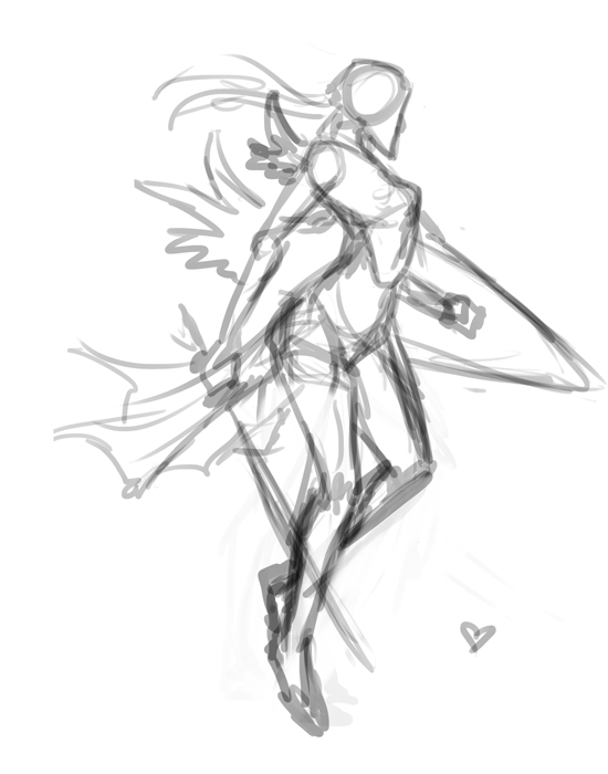 So here I've chosen to use Pose 5 as my final piece. It has a lot of potential of showing off the armor and the sword, but also the physique of the character.
  I've cleaned up and fixed the anatomy up a bit, also tweaked the post a bit so that I can show what I really want. I've also added a quick very sketchy drop of background element to add to the piece.
 So I've roughly added the final designs that I chose for the character such as the armor, the hairstyle, the sword, and the shield. I've also roughly drew in what bits of the background I wanted to have and tweaked the pose a little further to get what I had in mind.
 Alright, so I went ahead of doing a couple of color explorations on the character. I haven't done that before so I'd do it quickly. I splash different color patterns to simulate what I'd like it to be in the final painting.
 I've took the one that I liked and brought to a grayscale to mix and match value, From there I've started refining the piece. One the way, I've fixed the silhouette once more and tilted the image slightly.
 Ok, I've cleaned up majority of the piece, it's kinda getting to how I wanted. Perhaps, to this point, I can test around with color then tweak the value some more afterward, There are a few things I couldn't get it straight but with some colors, i'm sure it will bring pop things out and push things back.
 Alright, So I've added color to the piece, and trying to get the value and such in the direction that I've wanted. I noticed that going dark gray and white is too dull, there is just a really lack of color to the piece, so instead, i tweaked it towards blue. It felt better. It's still not up to the point of what I've wanted still, there are more refinements that needs to be done here still.
 So the Image is aaaallllmmooossttt done. I'm sure there are going to be a few touch ups here and there. Let's find something I can improve upon.
 Alright, I've finish cleaning up and touch up some parts of the picture. I can't really find much else or can't seem to think of what else I can change around. I suppose I'm ready to submit this. Though I might update it minor fixes in the future if I happen catch them.